Branding, web design
Debates of the Century at NYU Wagner
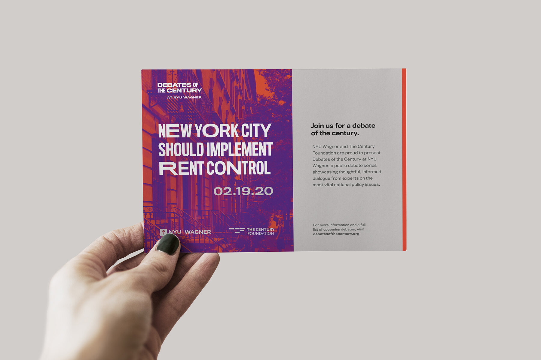
Branding concept pitched for the redesign of the annual debate series hosted by NYU Wagner and The Century Foundation.
Within any given topic, there exist polarizing views. Despite the clashing of ideologies and bumping heads, both parties can come to discover a common ground through passionate and active discussion.
Distorted typography represents the shifts in views and the physical push and pull of arguments “for” and “against” the topic at hand. The grey area represents common ground.
Client: New York University
Creative Director: Mark Courtney
Designer: Lena Kourgouzov


